A person I spoke with at a trade show told me that the WYSIWYG acronym could be more usefully rendered WUZZYMOLEWIG or, "what you see is more or less what you get", that translating RGB (Red / Green / Blue, the primary colors of refracted light) into CMYK (Cyan / Magenta / Yellow / Black, the more familiar primaries of reflected light) amounted, from an optical perspective, to converting three spikes into a flat line.
In the modern sign-landscape there's often just a fraction of a second available to read a message. The big ads whizzing by on the highway are usually coded in a way that allows us to take up these images very quickly: if a certain bottle shape appears, painted with certain colors and textures, we only need to see it for an instant in oder for our brain to fill in brown liquid, tiny bubbles, beads of condensation, even the brand name whether it's actually present or not. The colors and textures actually there might be simple abstract signs or detailed photographic renderings of every bubble, no matter--the brain has in memory a rendering of it's own derived from thousands of encounters with the same image. It's easy to add a flat color area using silkscreen: one of the real strengths of the medium is that, particularly using fine mesh, it'll put down a surface with no texture at all. The best way way to create a solid area is with handcut rubylith--a transparent red film on a tough mylar background. Before computer graphics, positives for photosilkscreen were inked or hand painted, made in a photo lab, or cut from sheet materials . Rubylith is opaque to ultraviolet light, so the red equals black (the open or inked area) when burning a screen. It's designed to be lightly cut with a (sharp but not too sharp) blade, and the negative areas peeled away. When preparing photoscreens from copies, most kinds of reproduction-- traditional photography or toner-based like copy machines and laser printers--tend to thin out in the middle of solid areas, which sometimes demands extra attention, however once an outline is established a silkscreen can be used to lay down an extremely uniform area of color. .
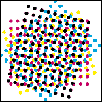
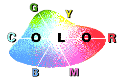
If we prepare two windows--one blue and one yellow--so that half of each prints over the other, the overlap would be green. If we add a third screen to print red, we can in theory print the entire color wheel. Substituting process colors (a red, a blue and a yellow each containing none of the other two) in fact enables us to approximate the entire spectrum. The eye can distinguish thousands, or millions of reds, yellows, greens and blues. These individual hues arranged in a rough triangle on a grid are referred to as a GAMUT.
In addition to the gamut for vision there's a (slightly larger) one for the colors that can be displayed by an RGB monitor, and a third, significantly smaller range that can be displayed with pigments, or reflective colors. Process colors (CMYK) represent an attempt to maximise the latter for purposes of reproduction. Screenprinting has it's own gamut inside the cmyk range and wet-on-wet fabric printing reduces the available colors still further. In art, limitations are often freedom-setting. People who remember old-time radio sometimes say they preferred it to TV because "the pictures were better". Early computer-game designers, constained to using as signs the eight colors then available (green plus blue=outdoors) were also using the brain's stored-up associatons as substitutes for the 64-bit landscapes to come, enabling players to project themselves into the game in a way that'd never again be possible. Fabric printing imposes similar constraints: when only a few colors are possible, but one or two specific ones can be managed it forces the question, "what is really necessary?", for example the particular green from overlapping blue with yellow might not be what we had in mind.
Printing solids only, cmyk is limited to eight or ten colors, but inserting a fifty-percent halftone in the overlap areas triples the range of available colors. Conventional (paper) process printing can generate two to three thousand different hues by overlapping percentages in increments of ten; wet-on-wet fabric printing can depend on perhaps sixty. The difference is mainly due to what's called dot gain: the more a dot of wet ink is likely to bleed on a particular surface, the smaller the number of different tones that can be printed. It's useful to have something like a jewlers' loop or other magnifier to look at halftone stencils--the physical landscape at 30X is fascinating, and it's easier to understand the aforementioned limits.
One way to start with halftones is to simply copy a newspaper photo to 140percent using a copy machine, making sure the black areas are opaque. The resulting 40-45 line (dots per inch) print can be transferred to a screen without losing too much of it's tonality. See: Silkscreens From Laserprints. Any computer document can be converted to a screen the same way, keeping in mind that one point or one pixel is a good lower limit to the size of an object. Another useful rule of thumb is that a screen will hold a line size one fourth it's own thread count: a look through the magnifier will show why.
Conventional (paper) process printing can generate two to three thousand different hues by overlapping percentages in increments of ten; wet-on-wet fabric printing can depend on perhaps sixty. The difference is mainly due to what's called dot gain: the more a dot of wet ink is likely to bleed on a particular surface, the smaller the number of different tones that can be printed. It's useful to have something like a jewlers' loop or other magnifier to look at halftone stencils--the physical landscape at 30X is fascinating, and it's easier to understand the aforementioned limits.
Flashcure is a technique whereby bleed and loss of opacity can be controlled by drying the work surface in between applications of color. The point where each layer goes down on a dry surface is where screenprinting can really start to take advantage of desktop publishing tools.
(to be continued: See The Repeat Print) |
 gamut
gamut